Introduction
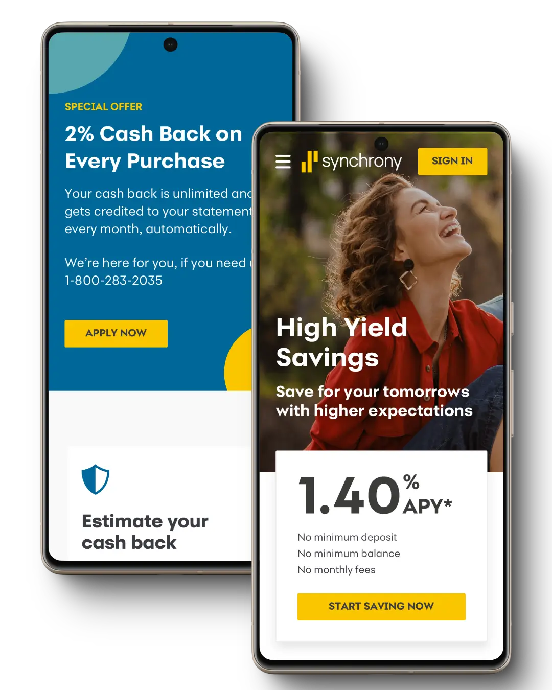
Synchrony Bank partnered with Method to enhance the website design for their platform.
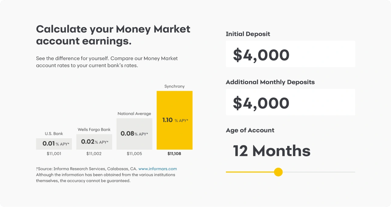
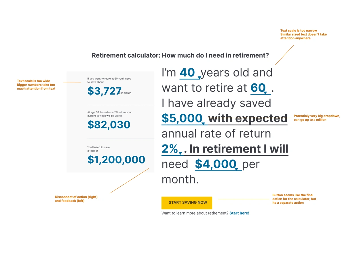
The project focused on overhauling unsatisfactory internal designs, particularly addressing UX issues in the calculator component.The team also aimed to ensure accessibility compliance by refining visual design, improving navigation, and integrating screen reader compatibility and keyboard navigation. The goal was to create a more intuitive, user-friendly interface.
Visit website
The final designs went live on the website in August 2023. Since then the designs have been iterated and evolved by the team at Synchrony.
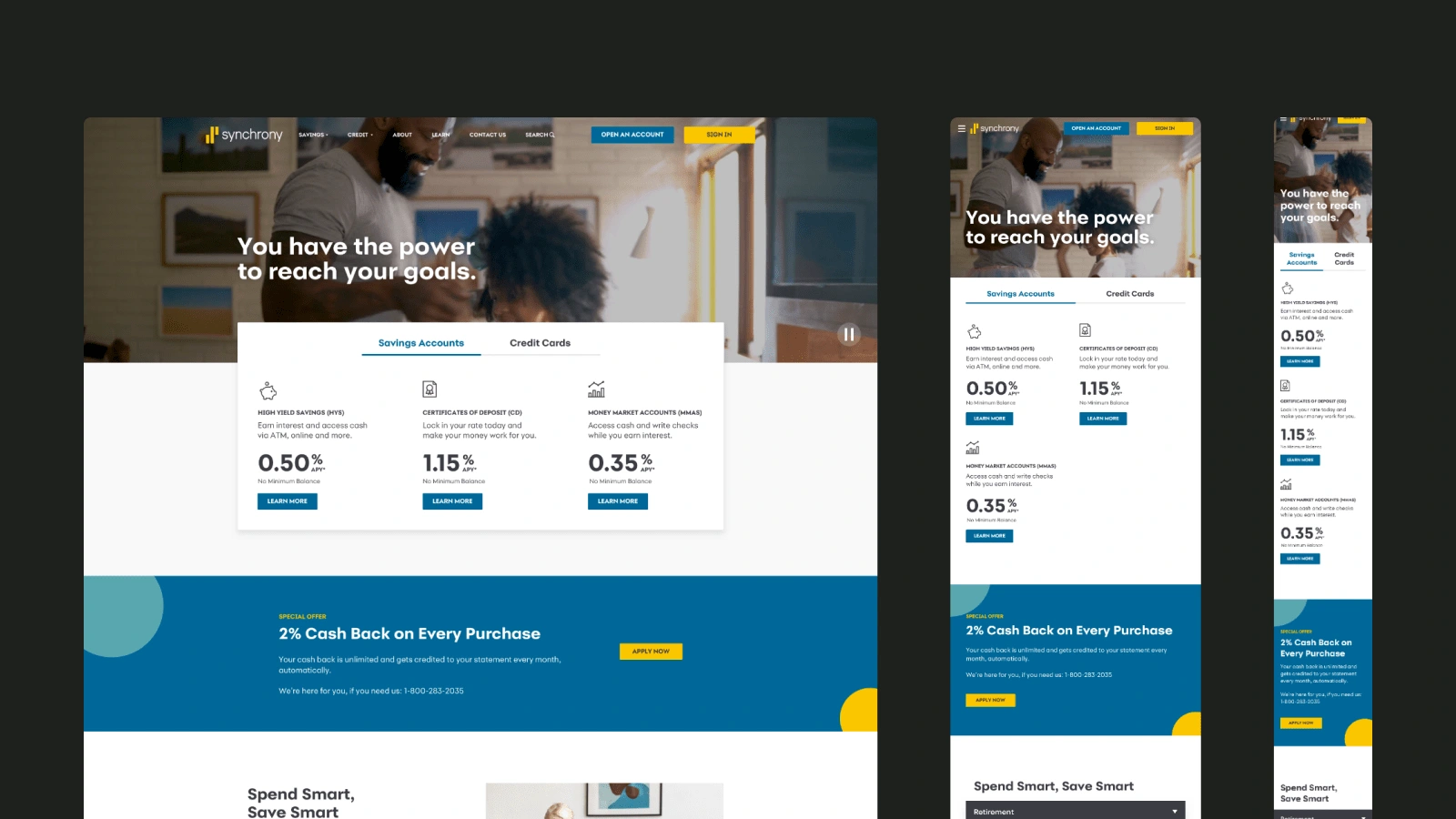
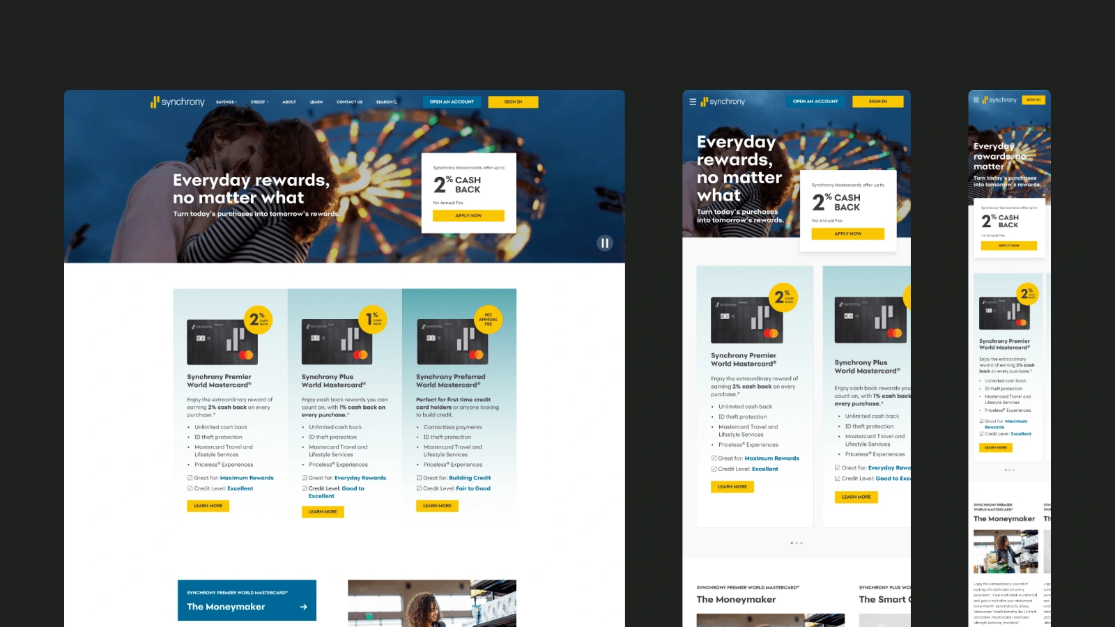
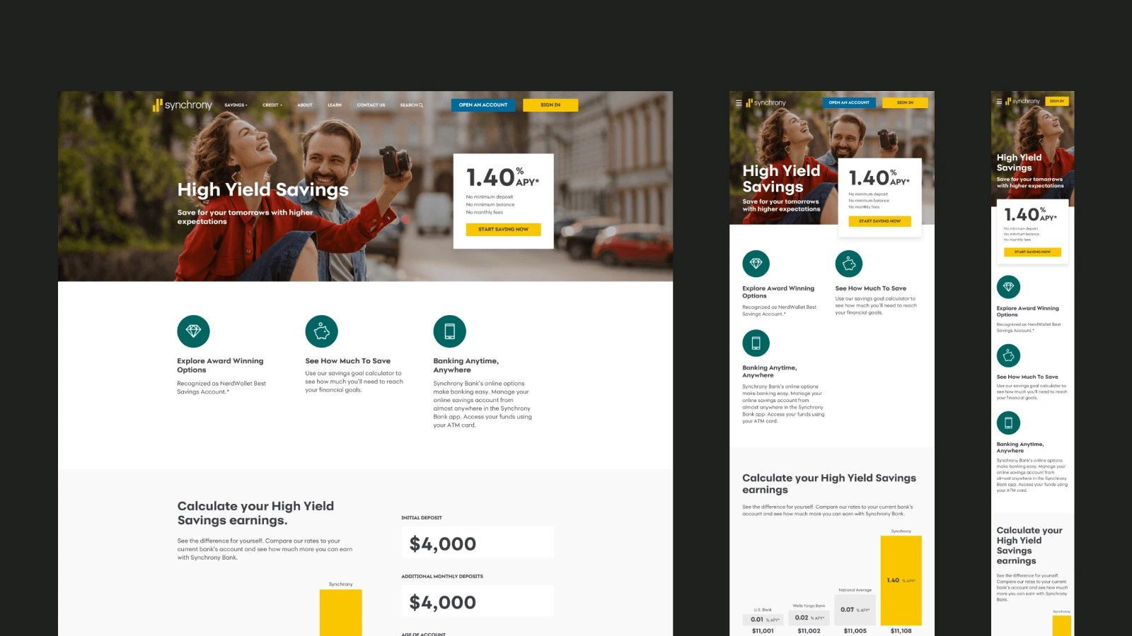
Synchrony Bank Website
Process
I conducted a critique of their internal designs to highlight key issues and outline my approach.
This helped them understand my process and instilled confidence in the final deliverables.
I ensured the new designs aligned with their existing design system to maintain brand consistency across all products.
I provided T-shirt sizing versions (XL, L, M, S) for each view to accommodate different screen sizes.
Website Designs