Problem statement
Polly is an employee engagement app for Microsoft Teams, Slack and Zoom. This project was for the Polly app on Microsoft Teams.
Polly has a lot of use cases. It can be used by casual users to poll for where to have lunch as well as whole HR department to conduct yearly reviews. They do this by sending 'pollys', bite sized questainares, on Microsoft Teams to other team mates or employees.
This mean that the process of creating a polly has to be simple enough for a simple poll and comprehensive enough for enterprise surveys.
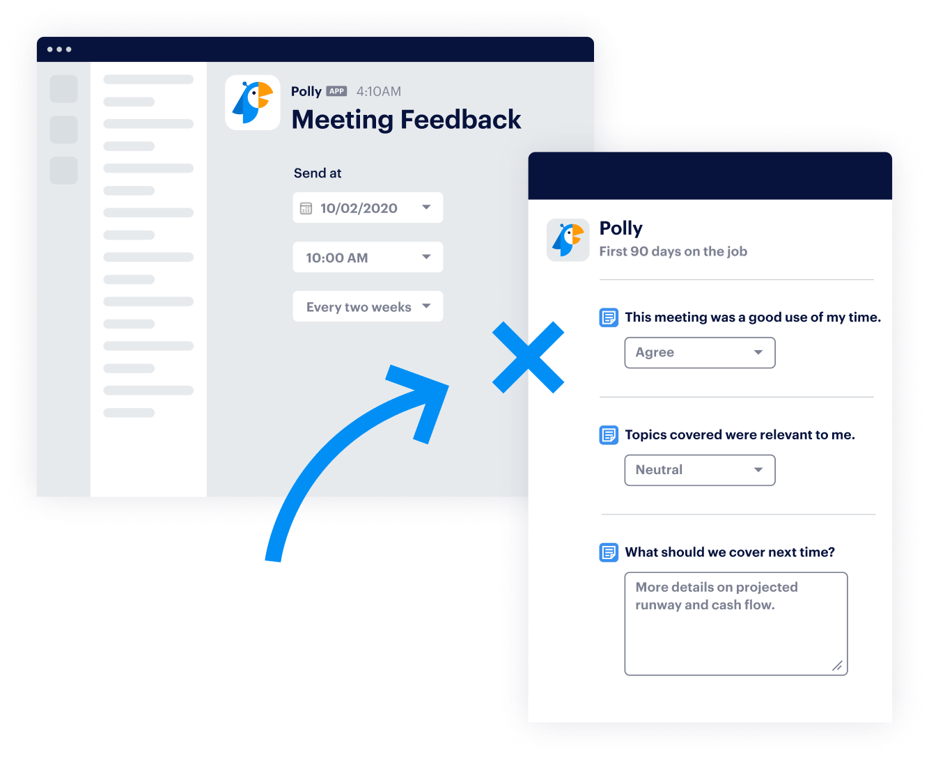
The form to create a polly however was made with enterprise customers in mind. This lead to a plethora of choices surfaced to the user when they went in to create a polly.
These input inputs ranged from something as simple as the question type and as extensive as scheduling reminder for those who do not reply up till a set date.
This meant the creation rate for new users in small teams was low. This was leading to a large section of new self-serve customer being lost as polly creation is a key growth metric.
Removing any of these field was not an option either as they were used by enterprise customers for their complex use cases.
Hypotheses for solution
The Product team used Amplitude data to identify which inputs were being used most historically. This allowed us to shortlist the inputs which can be tucked away.
The two main approaches used were smart defaults for most common selections historically and using progressive disclosure to allow the form to be expanded depending on the required complexity.
Another suggestion was to use a wizard style form where the form is broken into multiple steps. This was however was not favoured as the team's previous experience with wizard forms showed that dividing a form into 3 or 4 steps led to even more drop off. It also hindered quicker form completion for power users.
Design and Prototyping
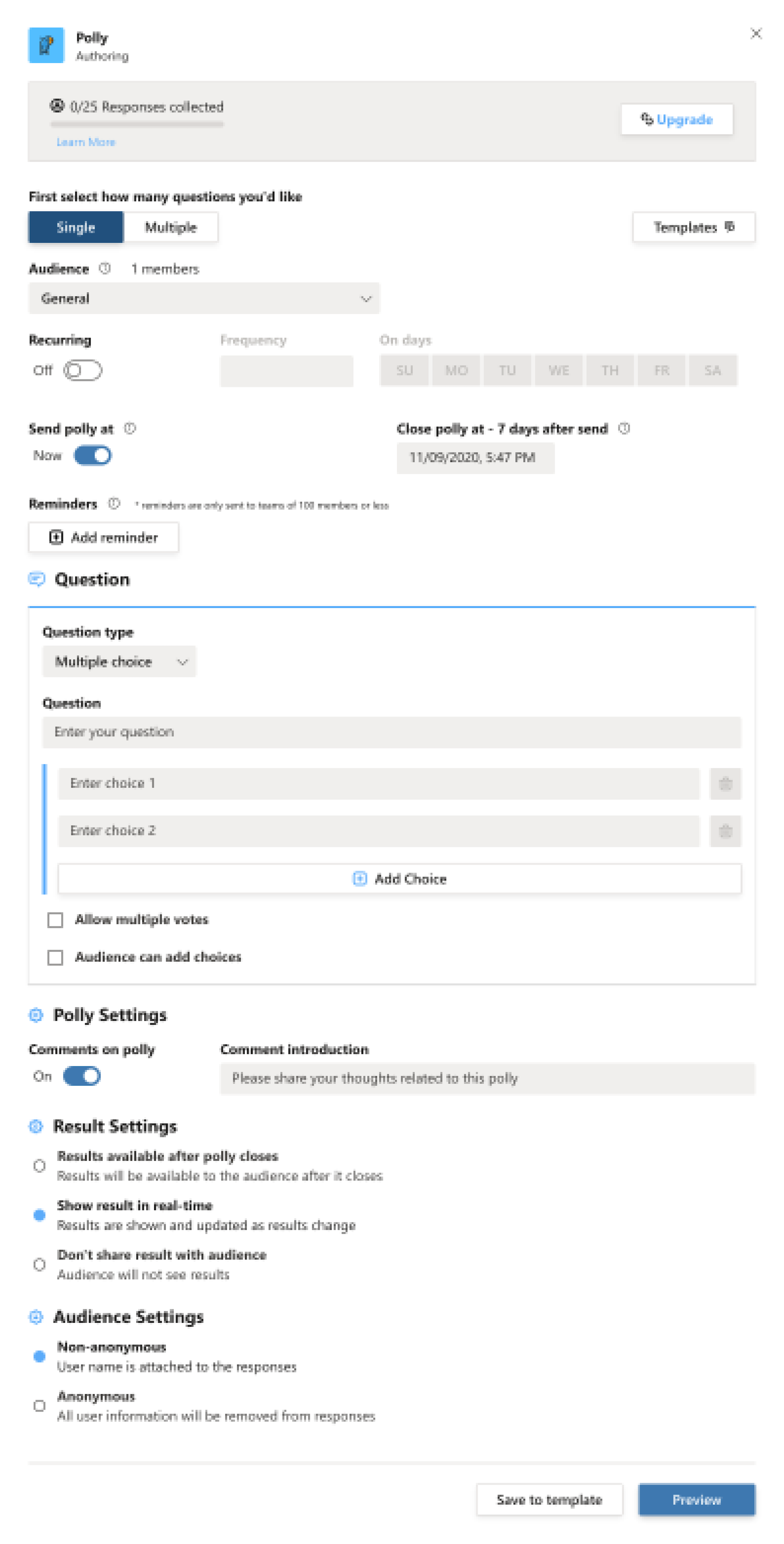
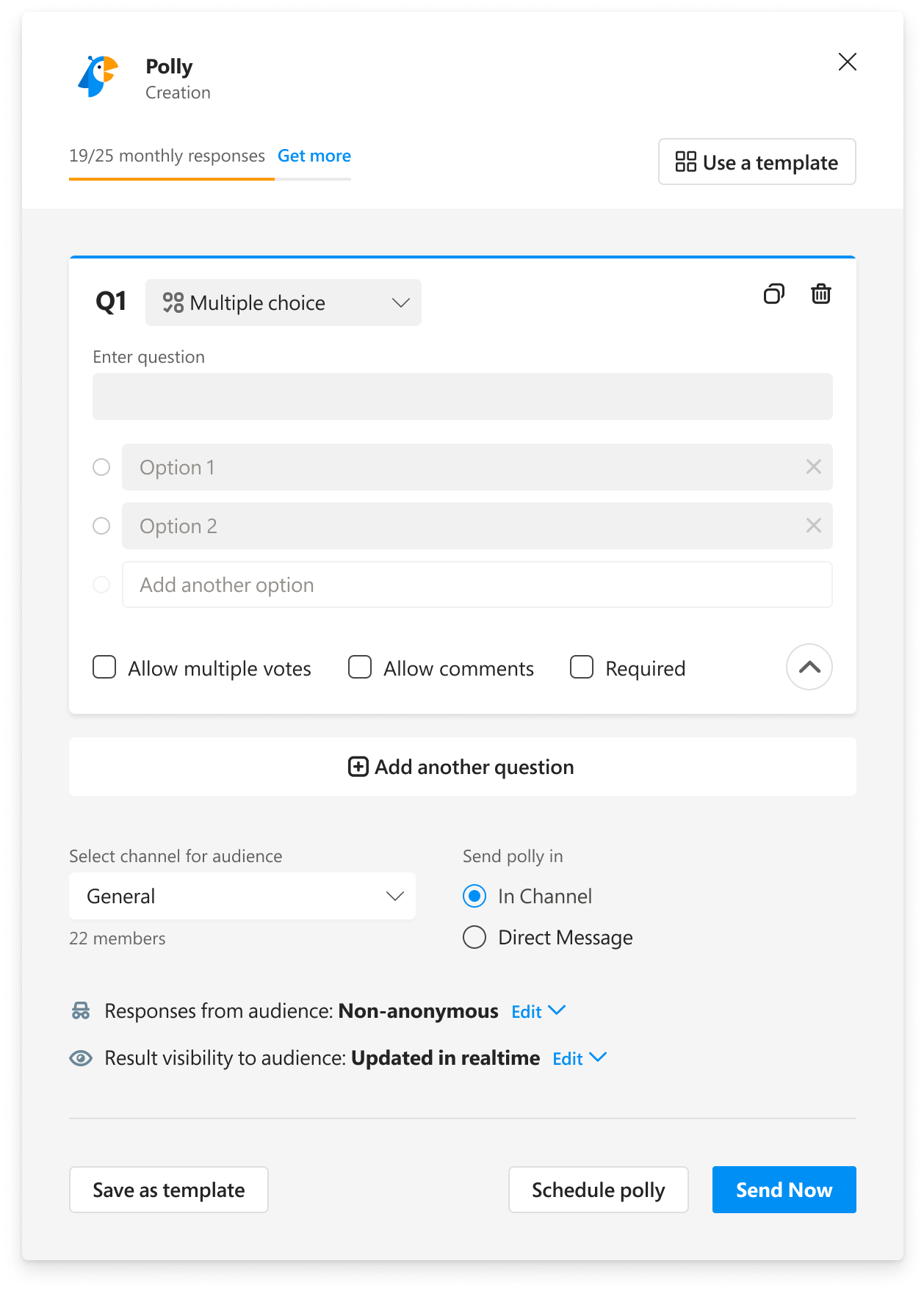
The most common type of polly identified was a singe question 'poll'. This was used as the smart default meaning a polly could be created with as few as 3 inputs.
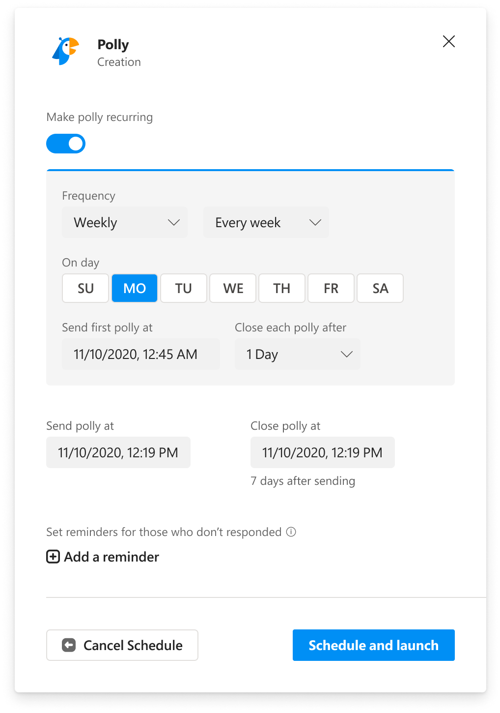
Scheduling and reminders were hidden behind a common view for 'Schedule polly' which had a separate CTA. This changed the modal view to transition into a deeper level.
This allowed us to considerably reduce the form's height. we also rearranged the order of the input so that the most important inputs logically came first.
The final prototype was presented to the Engineering team and handed off in Figma.
Results achieved
Polly creation was one of the crucual metrics that drove new customer growth. Those who created pollys regularly were the most likely to go on to buy a subscription. Thats why developing a habit around creating a polly on-the-fly was so necessary for the company.