Problem statement
Mauqa Online is an on-demand domestic help service that allows users to book workers for tasks such as cooking, cleaning, etc. As the number of returning regular customers increased, there was a need to be able to schedule multiple bookings through the customer app. There was also a major business case for this feature as it generated much more revenue than single bookings. So it was proposed to be added in the app as a 'subscription' model.
Previously, multiple 'recurring' bookings were created manually by the team using a backend portal. This took a lot of time as the user often had to provide 10 inputs, such as time for booking, how many per week, which days, for how many weeks, for how long, and so on.
Hypothesis for solution
Even when the team was guiding the customer in creating a recurring booking, it was difficult to make the customer understand and choose from so many options. Their requirements were simple but it often led to too many practical questions about each use-case. Translating this process into the app as it is, though technically feasible, was sure to be a disaster.
This was obviously a design challenge: how to simplify user choices yet remain flexible.
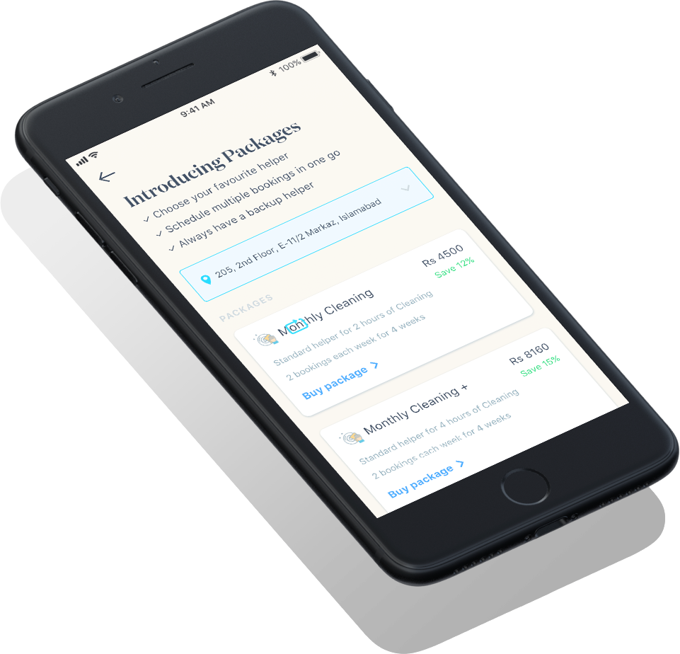
For this, I proposed that we 'limit' the options shown to a customer. The idea was to bundle most popular choices into a 'Package' and ask for only essential inputs.
Design and prototyping
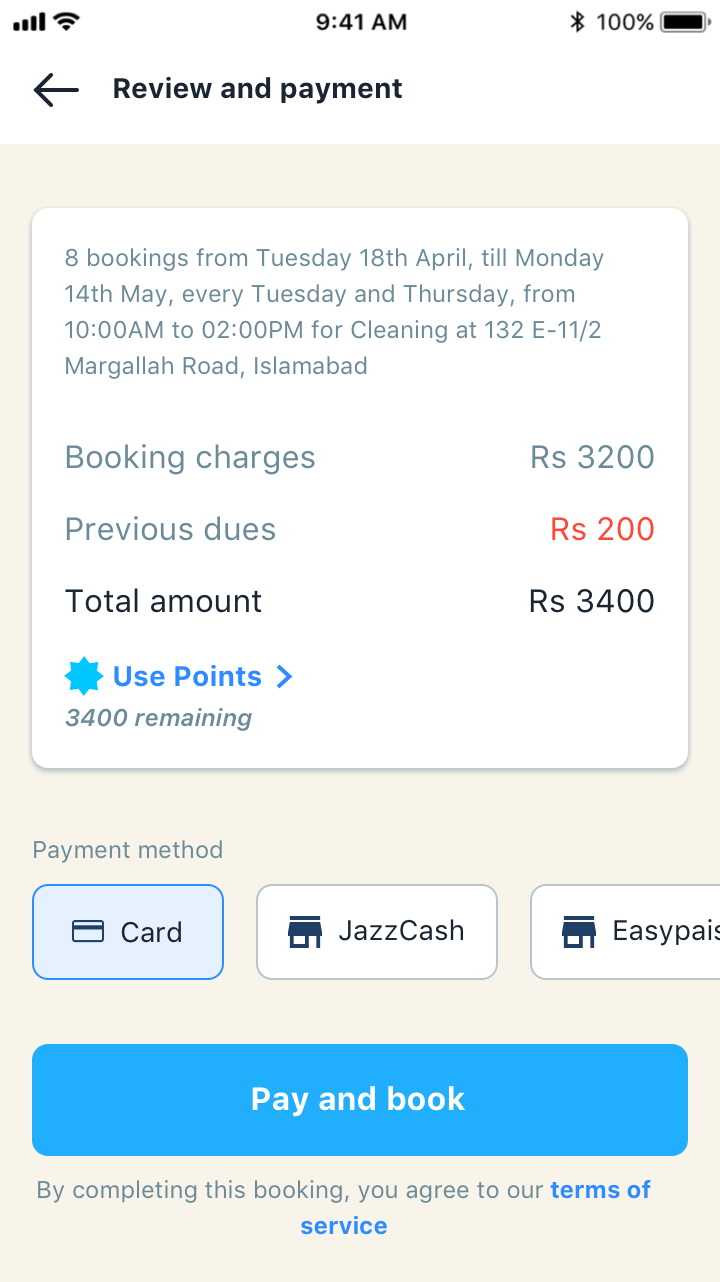
The Product team asked the Business Intelligence to run an analysis on the most common recurring booking requested by the customer. I used this to create a Package of the most popular booking options. I fixed the service (cleaning), booking duration (2 hours), bookings per week (1 booking) and number of weeks (4 weeks). This eliminated 4 customer inputs into just one package selection.
Another step I eliminated was the user's location selection. For a single booking, user always had to select one location from those they had saved. I ran an analysis on how many customers used multiple locations. It turned out that 95% of the customers used only 1 saved location. Using this, I decided to have the customer's last location selected by default, instead of asking them for it every time. This eliminated another input for 95% of the cases.
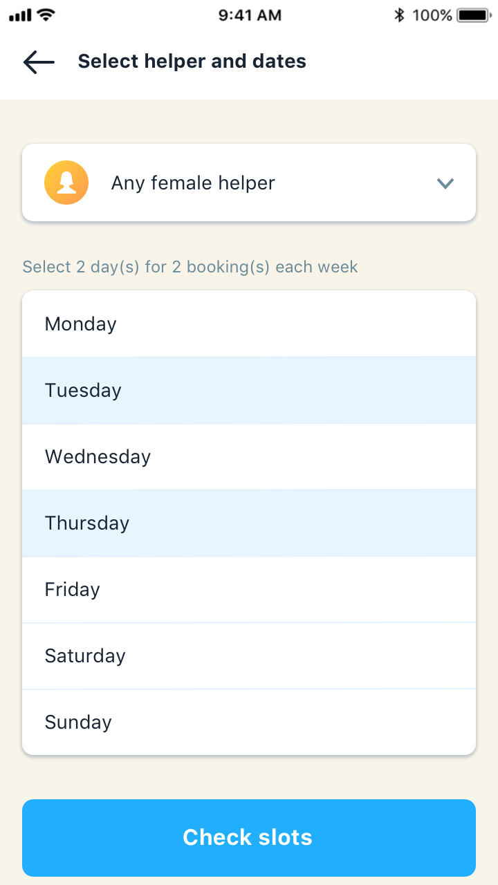
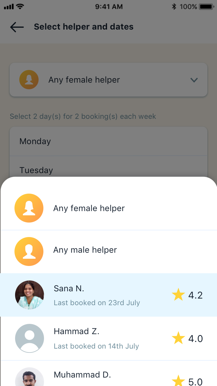
In the single booking flow, customer could select their required gender and have the option to book a previous helper. For Packages, I decided to combine these two options into one selection. As female workers are booked more than male workers, I set the gender option to female by default.
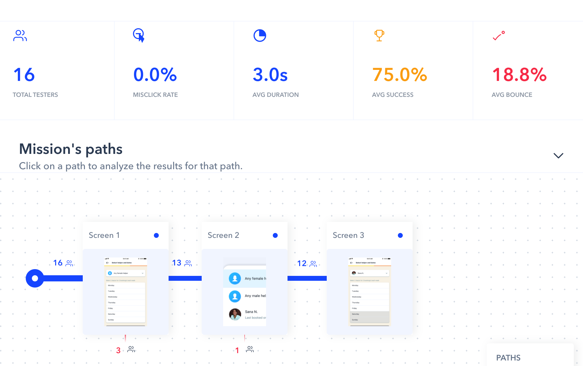
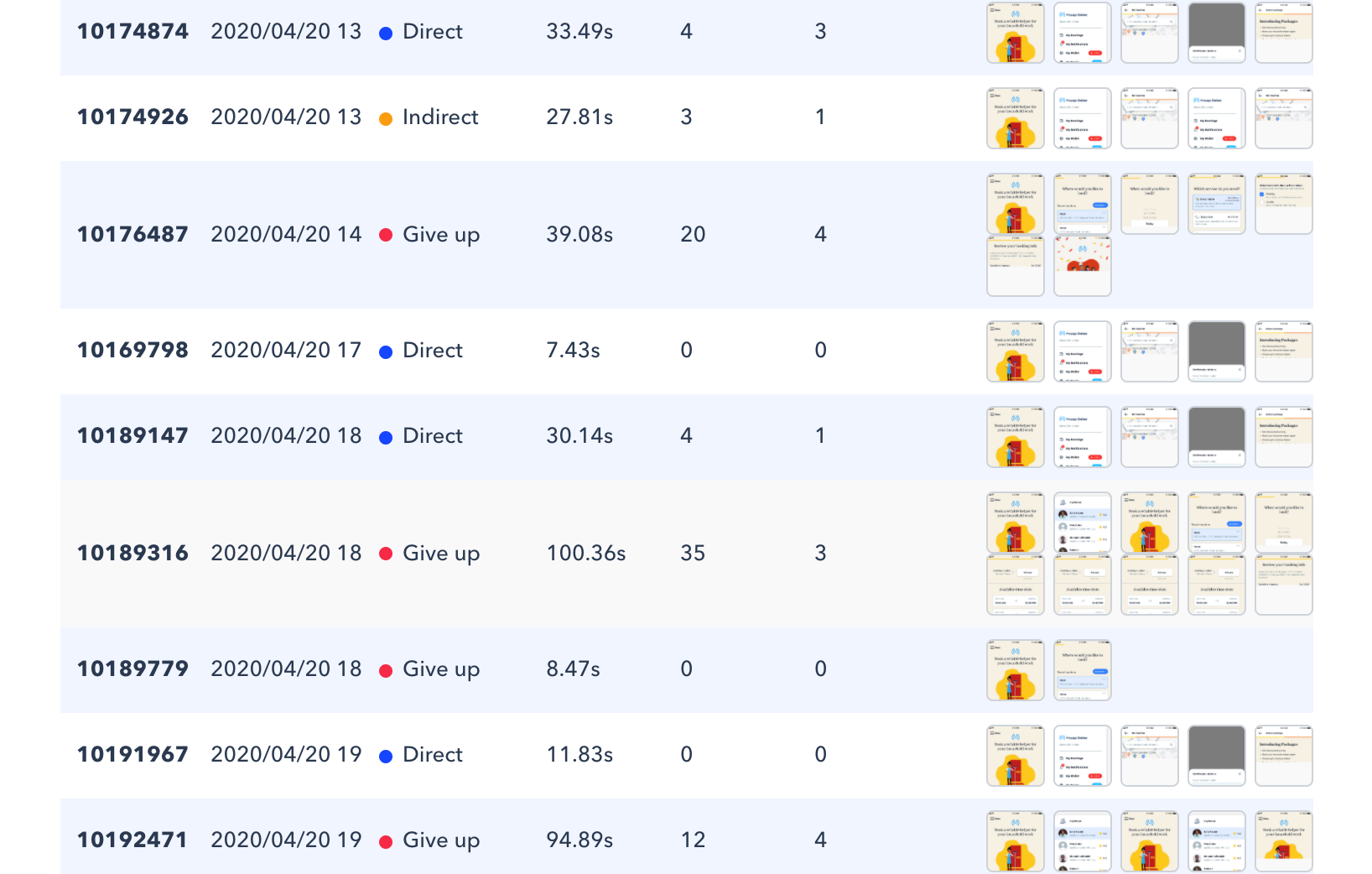
I then designed the screens in Sketch and used Invision to create a clickable prototype. I added the prototype to Maze to create a prototype user test. This included performing tasks such as selecting a package, customizing it and buying it. I first conducted this test internally with 5 team members, followed by a questionnaire about their understanding of how a package works. After some initial feedback, I conducted the user test with 16 customers. Using their results, the designs were reiterated and the copy was improved.
Results and Learning
Inputs before
- Customer location
- Service requried
- Gender of worker
- If a previous worker is required
- Tasks to be done
- Number of weeks
- Bookings per week
- Days of the week
- Start time of a bookings
- Duration of a booking
Inputs after
- Package required
- Gender of worker or previous worker (combined)
- Days of the week
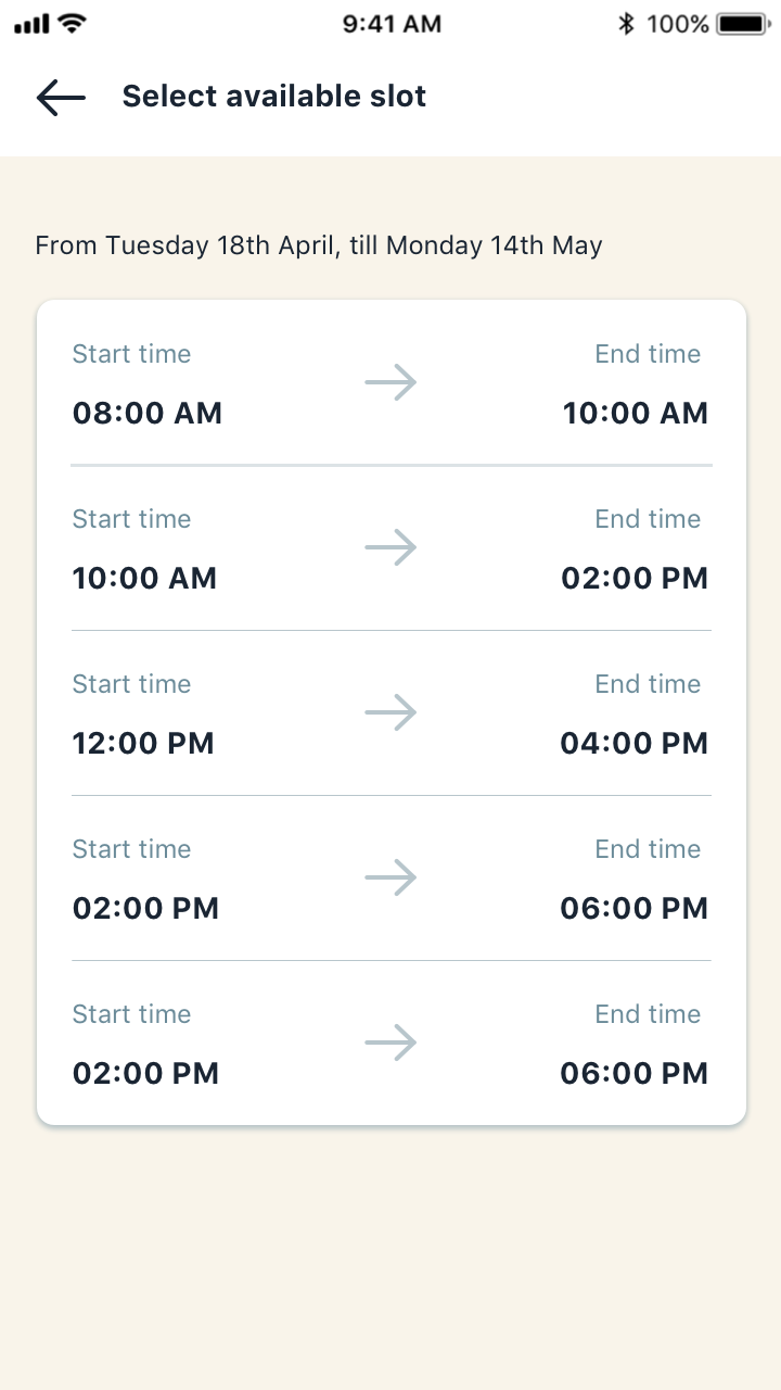
- Start time of a bookings
The feature is still in development so actual adoption is yet to be quantified.
However, in this case, the user experience is also dependent on the copy and messaging, not just the UI. It is crucial that a user understands why they are being asked for an input or how a package works. Copy in an interface is often overlooked in testing, yet often it causes confusion among users.
It is also a part of the designer's job to understand business requirements and to translate them into a desirable design. A lazy approach here would be to add 10 inputs into the app. Yet a good designer needs to put the user first and design the solution around them.