Problem statement
EasyInsurance is an insurance aggregator website, allowing users to compare and purchase insurance plans online. One of the top sellers on the site was travel Insurance. The company was running digital ads to acquire new customers, but the e-commerce conversion rate was so bad that the company was losing money on each purchase.
Identifying and understanding issues
To identify the drop-off points in the conversion funnel, I integrated Heap Analytics, a product analysis software, on the website. Unlike Google Analytics which only gives funnels by pages, Heap also provides events on each click. This allowed me to create a detailed funnel of the whole purchase journey. Within a week of data collection, I was able to identify 2 major roadblocks in the funnel along with other under-performing sections.
The next step was to understand why these drop-offs were happening in the first place. For this, I used two approaches:
- I intergrated FullStory, a session recording software, on the website. This gave me recorded sessions of actual users struggling with the journey. I narrowed down and observed their interactions with each feature. This highlighted usability issues, responsiveness issues, feature discovery issues, and more.
- I intergrated a Drift, a livechat software on the wesbite. I setup triggers for it at each major drop-off where a message would pop-up to ask if the customer was facing any difficulties. Using their responses and with the help of the customer support team, I was able to identify issues in lack of understanding, trust, missing information, and other concerns.
Changes and iterations
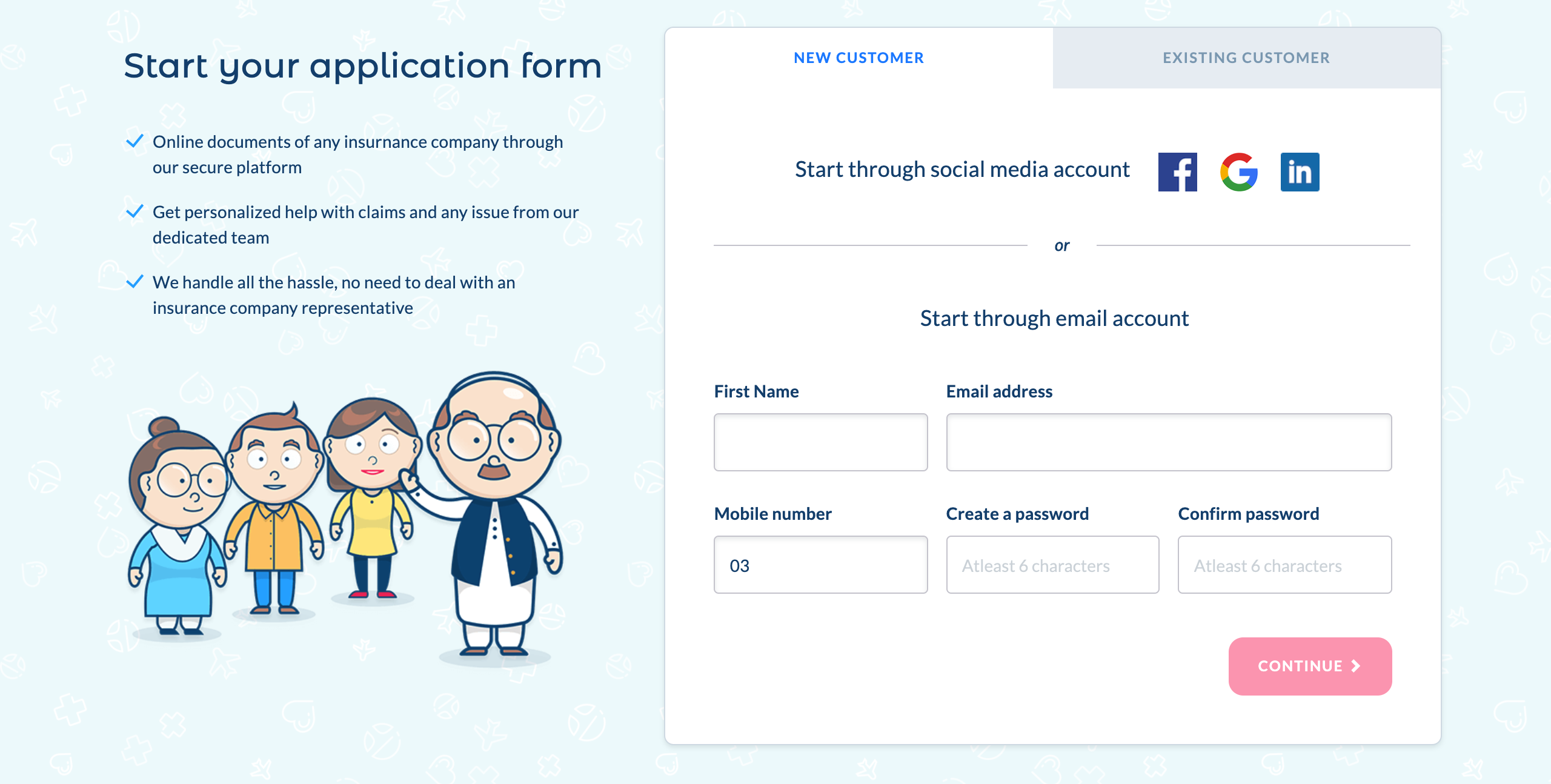
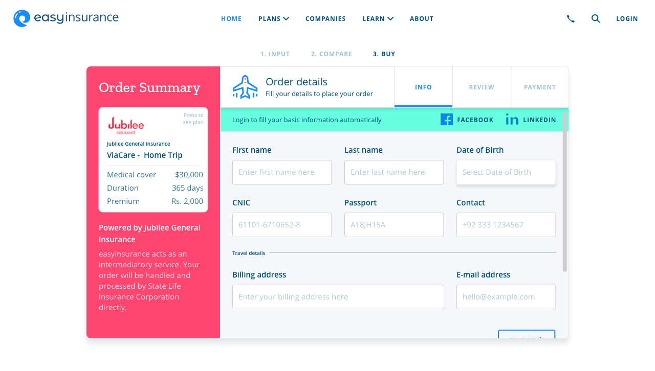
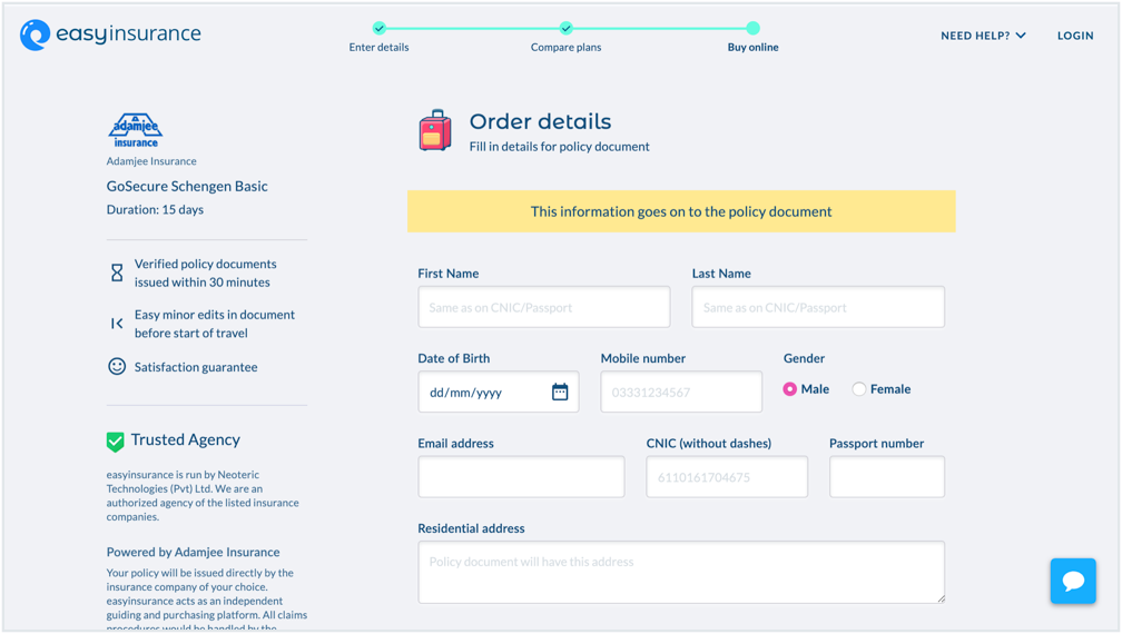
The first major roadblock was a sign-up flow that appeared right after a customer selected a plan to purchase. This was there so a user could create an account where all their plan's documents could be stored. 75% of customers were dropping off at this point. I started by improving the sign-up form and listing clear reasons and benefits for signing up along the form. This reduced the drop-off to 60%, but it was still too high a figure. So I worked with the development team to have it removed entirely. It cleared a major roadblock and the account feature was not requested by any customer either.
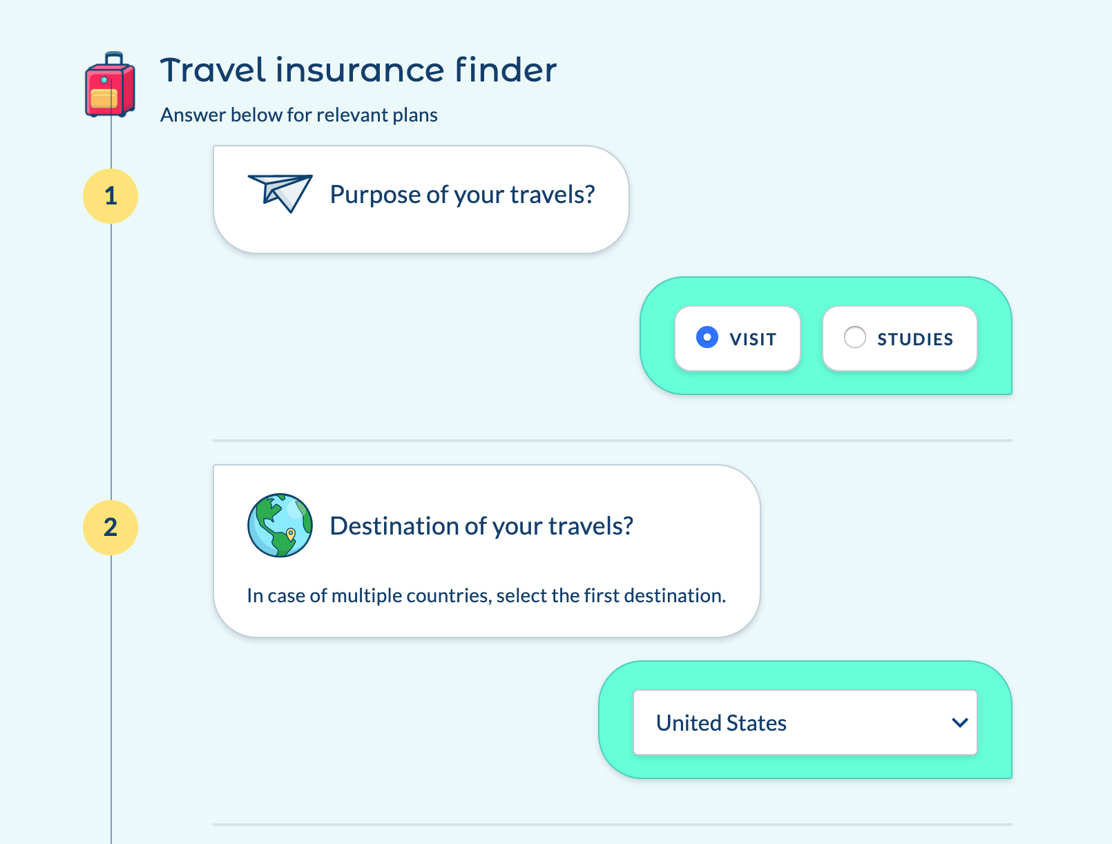
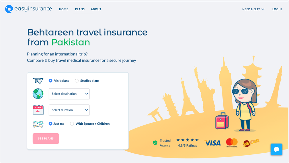
The other major roadblock was the input form that generated plans for the customer. There was a chat-bot style conversational form that asked users each of their requirements. It was functional, but badly implemented. There was a 20% drop-off at this stage. Although this might be a smaller figure, but since it was at the start of the journey, its implications were much higher. For this, I moved the input form onto the landing page, rather than being a separate page. I also made it much simpler and shorter.
Other issues occurred at the purchase form of the plan, where a user had to fill in 15 fields. Seeing a long form deterred and double-minded a lot of our customers. Using their feedback on the livechat, I improved the design and copy of the form. These required much more iterations where I refined the visual design and the copy of each input, until our customers stopped being confused. I also highlighted the website's USPs and guarantees at this stage to build more trust for the platform.
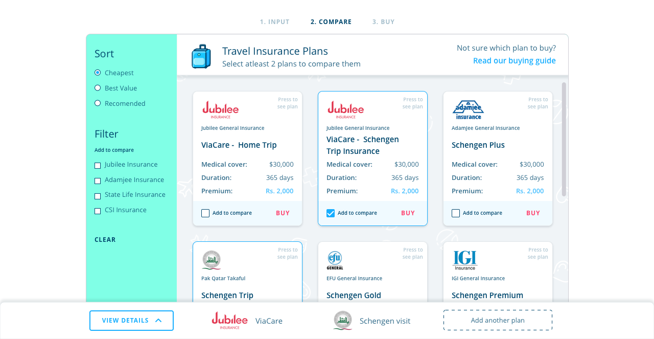
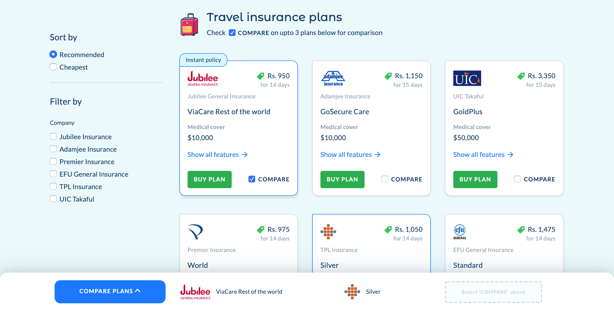
Besides this, I worked on the interface design to declutter and simplify the journey visually.
Results achieved
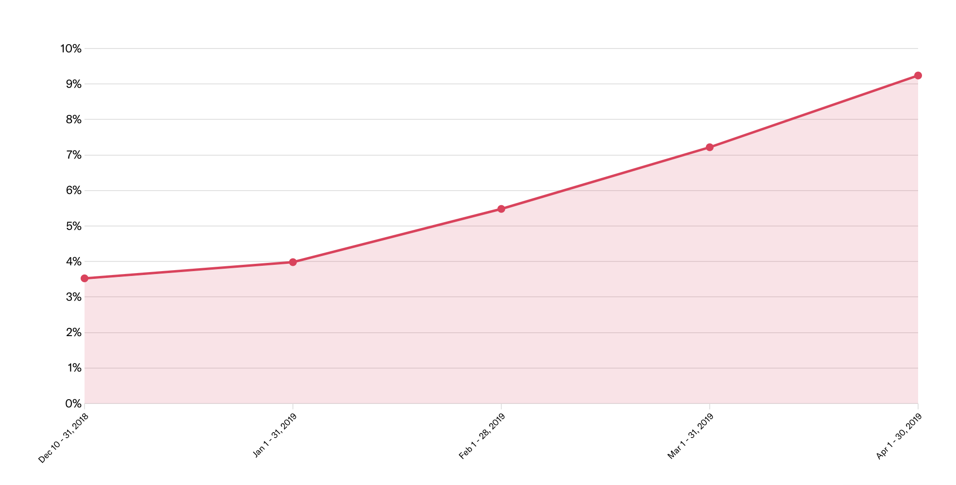
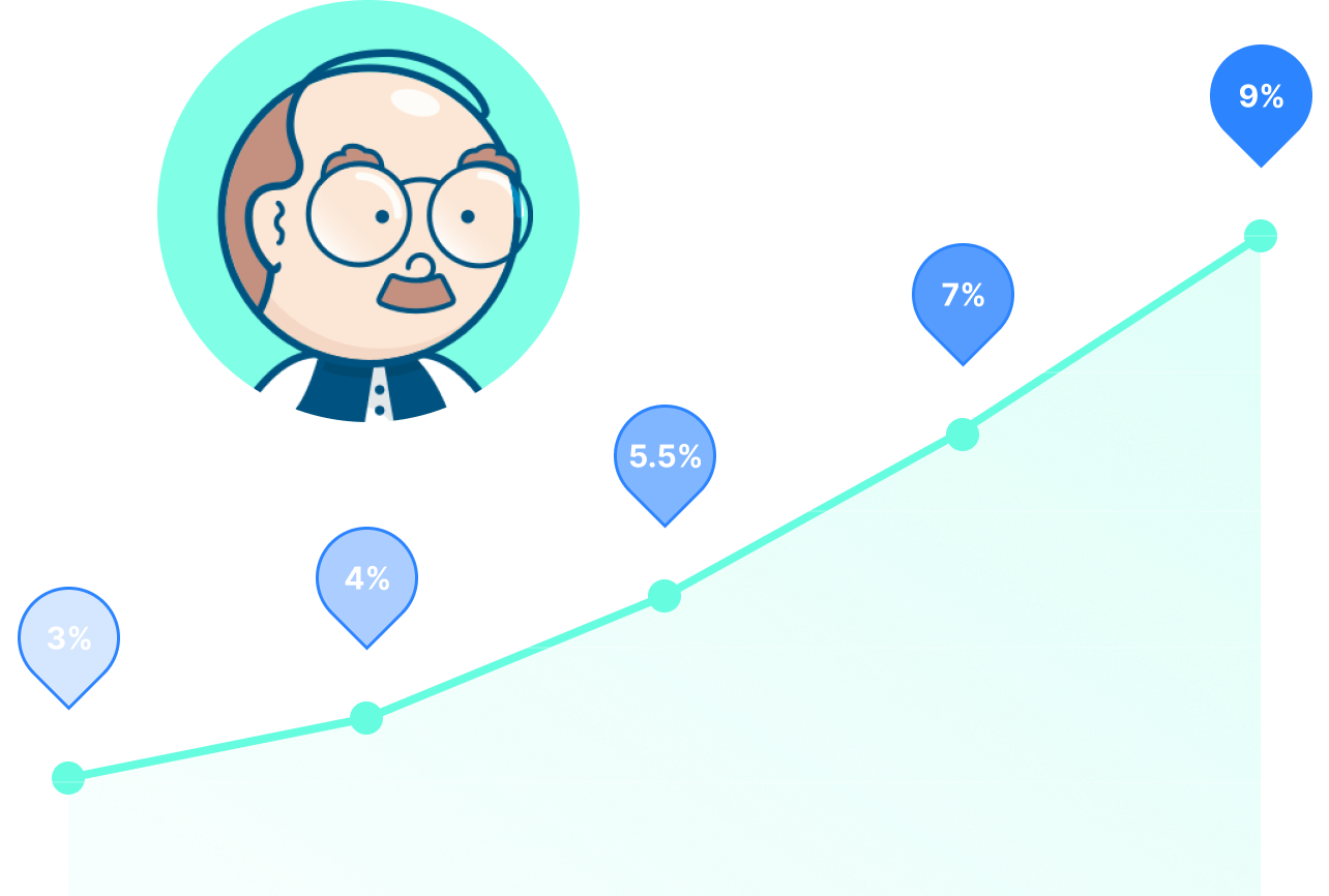
This led to a big reduction in the Customer Acquisition Cost (CAC), which meant that each purchase was generating profit. This meant that the company had unlocked a growth channel and could invest in more marketing budget. Over the next year, conversion rate continued improving to reach 5 times. Consequently the revenue generated each month through travel insurance also increased by 10 times.